I’ve wanted to do this for ages, but I’ve never had time just to push it out into the open. So, without further introduction, here’s a brief design history of plasticbag.org neé Barbelith.
Barbelith, it has to be said, had designs that predated this one. It had a number in fact. Unfortunately none of them have survived the test of time very well – files have been lost and archive.org hasn’t recorded their passing. The first vaguely well-constructed one (click on above for full screen-shot) was built by me hacking around with tables and adding things from the top down, feature at a time. It was considered quite good at the time, and remains the only single thing that I’ve designed in my life that has garnered universal good-feeling.
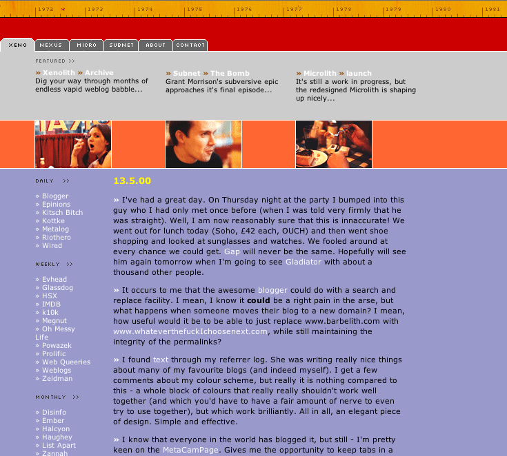
My weblog started as a piece of filler to sit on the front of my barbelith.com domain, which had within it a comic-book fan-site and what was later to become The Barbelith Underground. After a while it became clear that the people who were coming for the online community or the fan-site saw my weblog as incompatible with the rest of the community. So I decided to split my efforts over two domains – and plasticbag.org was born. I spent a considerable amount of time getting a design that I was exceptionally happy with assembled over several weeks. No one liked it. No one at all… It remains one of my favourites…
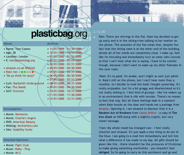
The main criticism of the pale-blue plasticbag.org design had been that it was too cold, so when I came to version two I made a conscious effort to make it more friendly. During the process I got terribly excited about ways of using black in tasteful and creative ways, the integration of random images into designs and the potential of right-aligning sites. I got particularly interested in ways of crafting a site that looked well-finished, which was why I put such a lot of effort into the bottom of the page – an area normally considered with distain or indifference by webloggers (with a few notable exceptions).Of my plasticbag.org designs, this is the one I look back on most fondly.
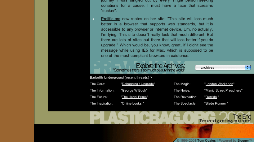
Version three of plasticbag.org came about because I was desperately pining for elements of the pale blue design which I’d always seen as representing the kind of modern disposable slightly artificial mood I’d always wanted to generate. This time, however, I was working with a classy designer of considerable repute (Denise Wilton) and she was patient enough to round robin designs with me until we came up with something I really liked and thought captured the mood of the site well enough. It had several ‘innovations’ for me – it was my first pure CSS site and the most difficult to build of anything I’ve ever made. It never worked perfectly in any browser. There was always something that made it feel wrong. It also used different style-sheets for the internal site and the front-page, so I could put content on half of the index and let it fill the page when you went into the archives. It was a nice trick, but fundamentally flawed. The text on the front-page was not a suitable width for long-reading, and I came to write smaller, more condensed pieces simply because it was all a reader could manage. Images had to be tiny to fit the width and then looked out of place internally. It was a glorious folly, but it was a folly nonetheless…
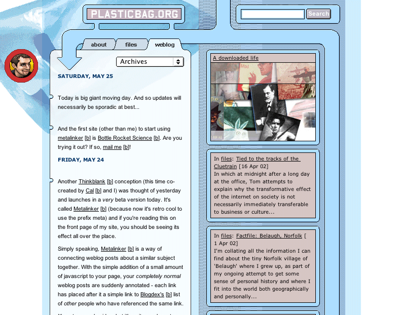
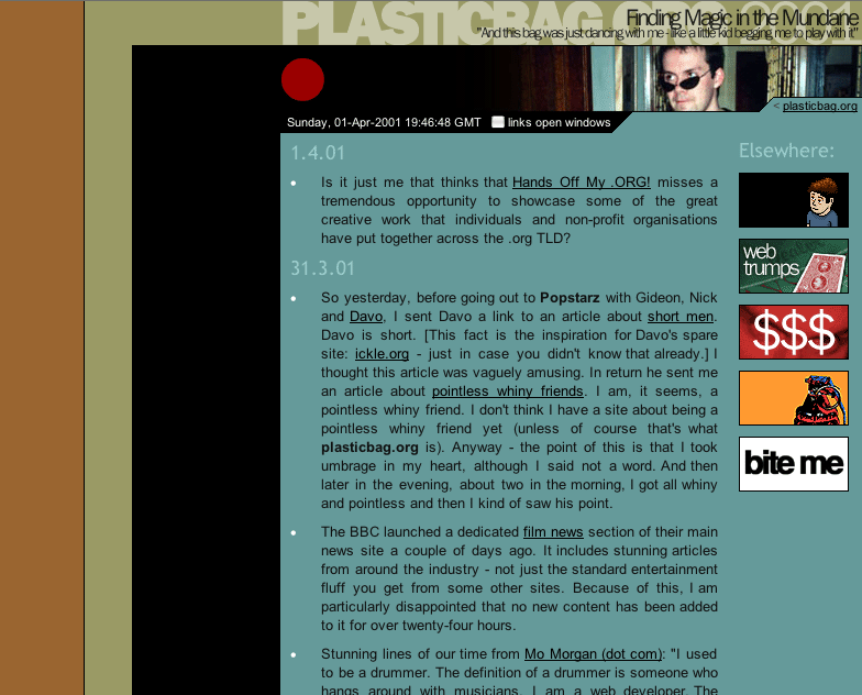
The design that replaced it is the one you’re looking at today – which brings us to the end of our little tour. I have nick-named this one “kottkesque”, it has some fairly obvious influences (kottke.org) and its creation came as a bit of a shock even to me. I spent an idle couple of hours thinking about what it meant to design a site for the weblog format – which was concentrated around putting long tracts of readable content on a page with almost no navigation at all, but instead quite a lot of ambient persistently useful peripheral information. And the more I thought about it, the more Jason’s work just seemed so practical – as if he’d uncovered a kind of ideal format that we should all now be looking at and working around. His was tables-based (and still is), so I pulled it over, rebuilt it in (slightly flawed) CSS and then started to try and push it in extreme directions – looking for ways to improve it in terms of branding, navigational areas and contextual information.
I’m not sure I succeeded in making that much of a contribution to what-comes-after his design scheme, except maybe in terms of abstracting navigational items in that top space. Quite possibly Jason’s design remains the clearest and most admirably platonic form of webloggery yet devised. However, I have my suspicions that his linklog/remaindered links format is pushing his format in directions it wasn’t really built to withstand, and that its showing the strain. This might be an indicator for where new investigations into weblog design should be concentrating their efforts. Perhaps erikbenson.com might have alternative lessons for us in this regard…
16 replies on “A brief design history of plasticbag.org”
Why are you always sucking up to Kottke?
(Also, I loved the last Barbelith-with-Tom design.)
Nnngh.
OK, so I first read plasticbag around the time of the second design, and have seen the Barbelith one before… but that first plasticbag design is great! Why the hell did nobody else like it? It’s stylish, clear, and it’s not cold per se, merely cool. Cool colours are easy on the eye.
I LIKED that first plasticbag.org design! Of course, I never said so at the time because that would have been far too forward of me. But yes, I did. You could bring it back as plasticbag ‘classic’, maybe?
As opposed to what? New Plasticbag? Plasticbag 2? Plasticbag X?
I always liked the Barbelith design best mydself – the random pics at the top were like the filler bits from ‘the Naked Chef’ or, to coin a new phrase – ‘Jamieoliveresque’
Stewart, I am a God among men. Why deny the truth?
I also liked the orange Barbelith design best…quite possibly the most pleasing design for a weblog ever. Really.
Err, I liked them all. Though the barbelith version was particularly striking for it’s day.
Was expecting you to mention the ‘nipples’ in ver 3! Hehe!
Oops. Normally am just a lurker. But couldn’t resist this one 😉
The permalink nipples! I’d completely forgotten about them.
Once, having 30 or so weblog windows open, I read through an entire plasticbag.org entry before realizing I wasn’t reading kottke.org.
Oh come on… He’s not that good…
Now being a jannie-come-lately I’ve only seen your current design, but comparing it to the previous version, I think it’s still the best.
Minimalistic yet with its own personality.
11 Weblog Pieces
Forgive me, it’s the end of the day and I don’t want to write my usual lengthy blog post. So I thought I’d do the blogging equivalent of “piano pieces”, which in this case is a collection of various links…
On RSS feeds and upcoming redesigns…
This is more of an update than a post and won’t be of enormous interest to an awful lot of you, I’m sure. Basically for those of you reading this site via an RSS newsreader, I’ve decided to remove the…
I think at the time I said that Plasticbag design #1 made me happy. And I think the colouring on my current ‘design’ was influenced by it, eventhough your #1 no longer existed when I made it.