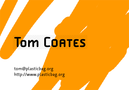
While I was doing the redesign for this site, I was trying to find an aesthetic that I could use in all kinds of other places as well. I experimented a bit during the process with some business card stuff that kind of didn’t come out too badly. As you can see, they’re a good deal more flowery than the rest of the site eventually became, but you have to strip back to rebuild (in design as in life). I think when I was doing these I was still pretty keen on acetate as a printing substrate of some kind. I hadn’t quite figured out how I was going to accomplish it though.


4 replies on “Some side effects of the plasticbag.org redesign…”
They all look sort of Underwold inspired.
Or, you know, Underworld.
Hi Tom. I like them – quite simple, bold and nice to look at.
I like them a lot – make sure you do plenty of background variants when you get them printed – but IMHO its looks that the kerning on your name is slightly off.
Between the o and the m of Tom, and the O and the A of COATES, is where I noticed it.
It could always be that screen resolution and even the diagonals in the background are making it look that way though, so do a proof before you commit to a run of course.