There’s a site that I keep coming back to because it’s so simple and well-constructed, and yet also represents so many of the visual and interface design principles of the current zeitgeist. It’s a site that has design smarts massively in excess of what would normally be necessary for a utility of its size and scope and needs of its users singularly well. It’s a site that I find myself returning to again and again for inspiration when I’m thinking about other projects. The site is carbonmade.com.

The service is simple – this is not a complex web app. It’s a place where designers and artists can come to quickly set up a really simple, clean and elegant online portfolio. It’s got a few problems around the place which I’ll come to later, but right now I want to concentrate on the great things about it and how generally well it’s been assembled.
It is, as must be clear from first impressions, drenched in the current design tropes of Web 2.0 – the fonts are large and there are gradient fills all over the place, but it’s all done with rather more character and personality than many other sites and introduces a few innovations along the way. This is a truly elegant riff on the current thinking, rather than a slavish copy.
Let’s start at the beginning – the character of the designer is the heart of the enterprise, and how to represent them and their work in the best possible way. Hence the cute, but not overly cartoonish character of the designer presented in front of an expressive green spray of look-at-me-ness. The whole site is already really there in that image – along with the six words that dominate the front page, “Sign up for your free portfolio”. Add the tagline, “Show off your work,” and you’ve just communicated the whole purpose of the enterprise in about three seconds of visual parsing time. If you’re a designer or an artist, you now know what the site is for:

The first thing you’re pushed towards doing on the homepage is to either play with the demo portfolio or start your own. The demo is a really solid idea – there’s no risk in misrepresenting someone else, no half-botched effort that other people can look at and mock you for. So if you’re a little unsure about this interweb thing, then you can play quickly and try it out with no risks. And I don’t doubt that – for the most part – sticking the demo up there has really paid off for them in the past, because the interface is incredibly simple – you basically create a project and then add things to it – using large, clear and open interface elements on large blank spaces. There’s no visual complexity. No confusion. No swathes of threatening buttons or navigational options. It’s all relatively simple. There are a couple of minor things I’d resist in that interface, I think. But they’re few and easy to fix and will probably condense themselves a little bit in some time.


Once you’ve got your pictures onto the page you can specify some very basic design attributes to help you define what your portfolio will look like. You can choose whether there will be text displayed on top of the thumbnails; whether you’ll get one, two or three thumbnails in a row on your front page; whether the background should be white or black; and whether it should use serif or san serif fonts. All through the process, mostly successfully, they’ve looked to see which of the Ajaxy or DHTMLish design elements would give you the feedback to know that something’s happening behind the scenes. They’ve also made elements of the UI discoverable, like the ability to reorder photos. You don’t need to use it, but eventually you’ll twig and it’ll be there wait for you. There is no rotate feature. There is no group functionality. There is little or no metadata. This is an experiment in creating super-elegant UI for a niche audience with a simple function to perform and when it works it works beautifully.
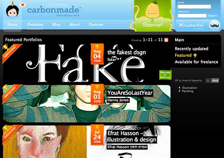
I think my favourite part of the site is the portfolio-browsing section. The porfolios themselves are pretty self-contained entities. There would be little reason for a client to want to know how you were presenting your work, so carbonmade restrict themselves to a small link at the bottom of each portfolio page directing you back to their core site. But that doesn’t mean you can’t explore the portfolios in the other direction – they maintain an index of all of the collections people have made, along with interesting ways of exploring them. There’s enough design inspiration in there already to last a couple of months. And they’ve done a really beautiful job in making all the work within the site look exciting and interesting. Have a look at their featured portfolio index page:
The whole thing feels tremendously immersive and exploratory and interesting – but more specifically, while the pages aren’t necessarily particularly light, the HTML is mostly solid and decent and degradable. As I said earlier, it’s not perfect, but it’s bloody good. And fun. And cool. And engaging.
The porfolios themselves are slight and elegant things which really let the artworks of the people concerned shine through. They constitute nothing more than an index page which lists the projects with a thumbnail, a page for each project with a Flash gallery upon it that you can use to scroll backwards and forwards through the pictures in that section and a page where you can talk a little about yourself as the creator of the galleries. This is no Flickr – it has no need to be. Here’s an example porfolio:

It’s literally an online portfolio in the sense that the background is as generic a property as the large leather presentation cases that graphic designers take with them when they’re trying to get work.
Anyway, I said there were problems with the site, and there are. Not all the interface elements are quite as self-explanatory as perhaps they might be, some of the exploratory sections feel a bit hidden as you’re encouraged quite forcibly to sign up and start using the, the portfolios have some odd navigation options that hide how you get back to the homepage and – my main issue – the individual images within each gallery tend not to be linkable. Because of the Flash elements you have to link to a project rather than an individual picture. But these are all fixable.
And in the meantime, I’m really getting something off the aesthetic and the scale of the thing – the expressiveness of the interface and the way in which it has made itself into a place that both has a personality but also has the class to get out of the way when it’s showing other people’s work. I think it will define as many of the next stage design tropes as it has stolen from the current ones and is well worth keeping an eye on…
8 replies on “On Carbonmade…”
This is a nice post. I’d never heard of Carbonmade before. You shoud do more of these design critiques!
The irritating spelling error there could stand to be fixed. C’mon, already, don’t spell “already” “all ready” unless you mean “all ready.”
I believe Carbonmade was created using the excellent Castle technologies which include Monorail, a C# framework which takes it’s cue from Ruby on Rails.
By which I meant the one on carbonmade’s page. Sorry.
Thats an incredibly beautiful site.
Thanks for the introducing this site and I think your design review on it is great. Please do more of this.
thanks! great review!
hi, I agree the sites a great way to showcase work. Unfortunately it seems like the sites down. Is anyone else having trouble accessing the site?